Whether you hire a marketing agency, freelance talent or design in-house, it’s crucial to have a clear understanding of what makes a logo OK versus extraordinary. A logo is the first impression prospects get of your company, and it represents the most excellent source of sustained recognizability for your brand.
The importance of a brilliant logo is indisputable, though arriving at “the one” is often a treacherous task. Below are some elements commonly found in great logos.
1. Well-researched
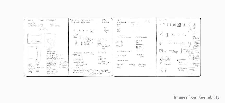
Performing the necessary research is essential to understanding a brand, its audience and the message that the final logo needs to convey. There must be a solid reason behind every symbol and font that is chosen by the designer.
There must be a solid reason behind every symbol and font that is chosen by the designer.
Pretty isn’t a good explanation. Before a great logo is produced, there will be many ideas that are discarded. This is common, and in all likelihood, the final logo will not be the first design you sketch. Skipping the research phase will result in a weak — thus inefficient — logo.Â
How to check: Did you ever wonder how much thought and rationale was put into the logo you were presented with? Ask for the sketches or research that preceded your final logo.
An excellent logo presentation will detail not only how your logo was conceived, but also it must be accompanied by a concrete rationale. Furthermore, don’t expect to see your logo any sooner than two weeks. If you encounter a faster turnaround, some part of the process was likely neglected.
2. Unique
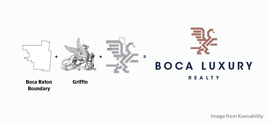
A great logo is completely unique to your brand and not easily confused for any other business or company by those who view it.
Its uniqueness might feel unfamiliar to you at first, but a unique logo will be instantly distinguishable and far more successful than something we’ve seen time and time again. A unique logo becomes iconic. Iconic is achieved with creativity.
A unique logo becomes iconic. Iconic is achieved with creativity.
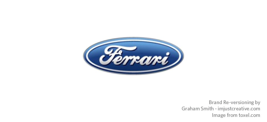
How to check: If your logo looks familiar — or you can swear you’ve seen it somewhere else before — you need to reject it. Your logo should represent your brand — and only your brand.
3. Simple
Keep it simple. A great logo doesn’t use a wide range of colors, nor does it contain an excessive amount of elements that it aren’t quickly discernible.
Layered elements in a logo can easily blend together creating confusion, and viewers shouldn’t have to dissect a logo to understand what it represents. The simpler your logo, the more quickly a viewer associates it with your brand.
The simpler your logo, the more quickly a viewer associates it with your brand.
How to check: When it comes to your logo, what is essential? If there are elements of your logo that serve no purpose, they are just visual noise. As the old saying goes, less is more.
4. Appropriate
Both your brand and company will dictate the look of your logo. It should convey the right emotion and also make sense to your target audience. Imagine if Ralph Lauren traded its logo style with Hollister. It wouldn’t be appropriate nor relate well with their existing clientele.
How to check: What is your immediate reaction to your logo? Does it convey the right tone for your business? More importantly, what is the immediate reaction of a target client?Â
5. Functional
Your logo has to work everywhere for it to be great. A logo can’t be designed exclusively for the full-color billboard ad you are running next month. It also has to work in one color, be it black or white (knocked out).
It also must function properly across all media, including your mobile site, social media platforms, letterhead, print advertisements and more.
How to check: Ask how your logo will render in both print and digital (small and large). A great logo will produce well in any environment, and it should be created from the onset with optimal functionality in mind.
A great logo will produce well in any environment.
6. Scalable
A great logo must look exceptional in all sizes. Think of all the digital media your logo will be used for, such as in the tiny profile image of an Instagram feed. Will your logo be recognizable at that size?
A logo that loses too much definition when scaled down is not effective. A brilliant logo is crafted to work beautifully at both 50 pixels and 50 inches.
How to check: Scale your logo to 5 percent and 500 percent. This will allow you to confirm that it reads well at all sizes.
Scale your logo to 5 percent and 500 percent to confirm that it reads well at all sizes.
7. Timeless
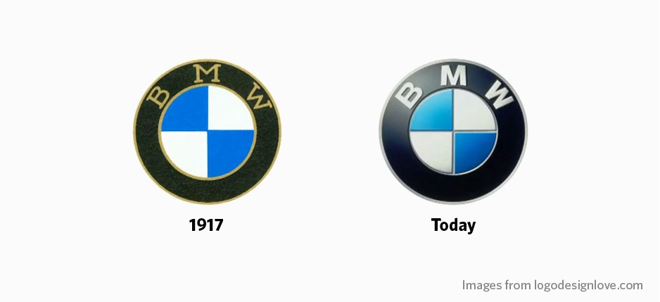
A great logo only needs minor alterations to remain relevant as the years go by. This requires a true mastery of design from the creatives who conceptualize and present your finished logo. If a logo is built on solid graphic design principles, it will last a lifetime.
If a logo is built on solid graphic design principles, it will last a lifetime.
Minor edits over time might be necessary to keep up with the ever-changing digital landscape, but if a logo is truly timeless, it will never have to be completely redesigned or depart from its original concept.
How to check: Wait and see. You could also research logos that a design agency crafted a few years back. If they still hold weight and accomplish the goals of the client for which they were conceptualized, the agency is likely reputable.Â
8. Strong
Now, we don’t mean that your logo should be able to effortlessly dead-lift 500 pounds. In this case, strong means that your logo should have a presence that demands attention and represents your brand in one glance. It should garner trust from viewers and also represent your business with pride.
How to check: Does your logo demand attention and stand on a solid foundation? If not, a rebrand might be in your future.
9. Memorable
Above all, a logo must be memorable. The goal of a logo is to make an enduring visual connection with your target audience, regardless of the context of their interaction.
How to check: Does your logo leave a lasting impression? Ask yourself and your target audience.Â
Does your logo leave a lasting impression?
Laura Ure is the CEO of Keenability, a marketing agency specializing in lifestyle marketing that targets the affluent buyer. Follow her on Facebook or Twitter.
Email Laura Ure.
Source: click here


