After six months of beta testing, Coldwell Banker on Thursday debuted the finalized versions of its new logo that will replace the well-known branding the company has used for decades.
The finalized version of Coldwell Banker’s new logo is similar to the design that the company unveiled in March when the rebranding effort was initially announced. It includes a large “CB” along with a star that is meant to symbolize the North Star. However, the finalized version also includes the words “Coldwell Banker.”
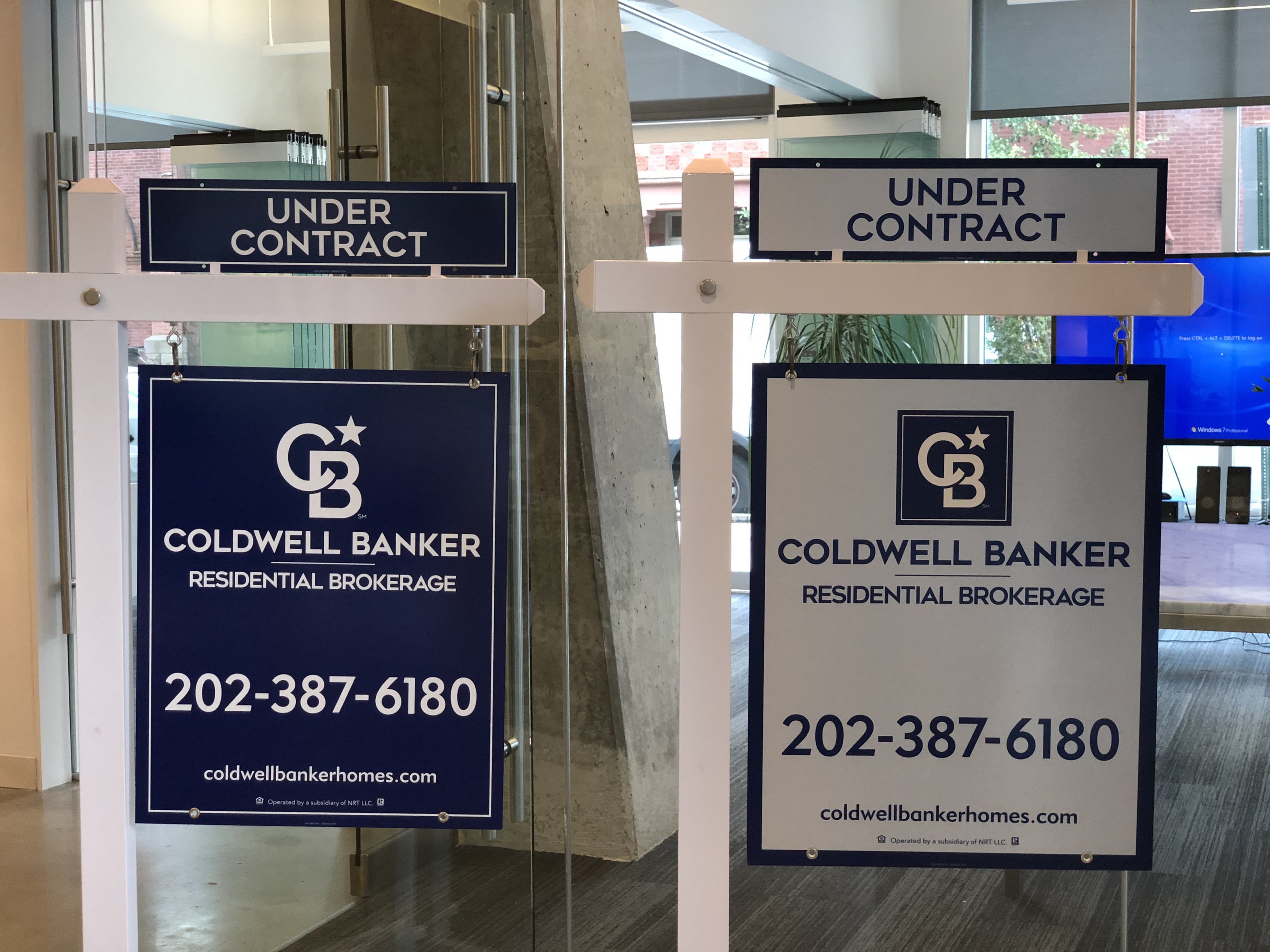
Two yard signs bearing the finalized Coldwell Banker logo | Credit: Coldwell Banker
In addition to a finalized logo, Coldwell Banker on Thursday released identity standards for its overall rebranding. The company has also settled on four yard sign designs that brokerages can choose from and has released a variety of marketing materials, office design elements and branded apparel.
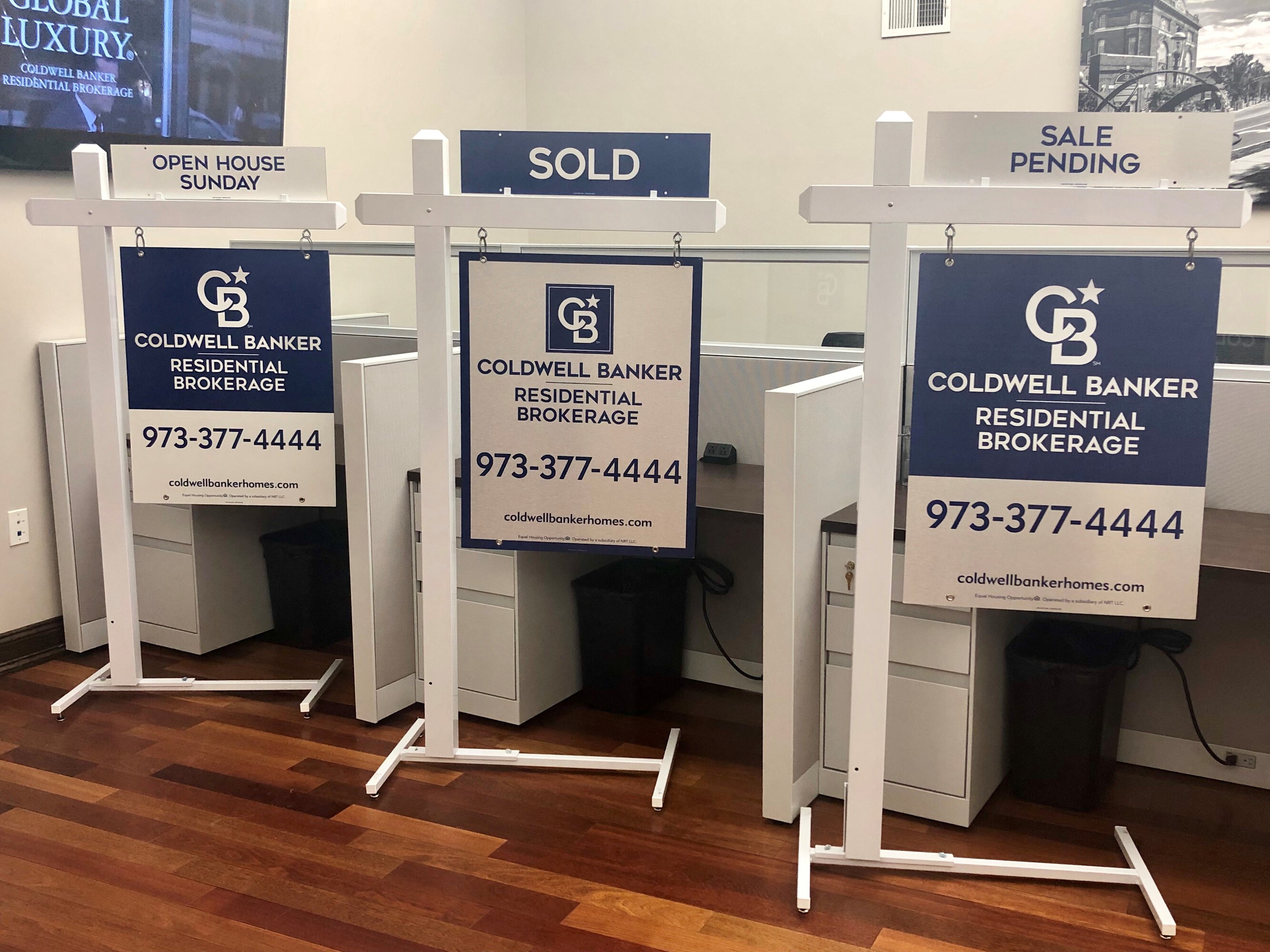
Some of the finalized yard sign designs Coldwell Banker settled on during its rebranding process | Credit: Coldwell Banker
In a statement Thursday, Coldwell Banker said that the finalized designs emerged through six months of “testing, iterating and perfecting the new brand identity.” The new look is also meant to “guide the company into a new era.”
 5 emails you should send to your sphere
Craft the right messages to the right people. But don’t forget what comes next. READ MORE
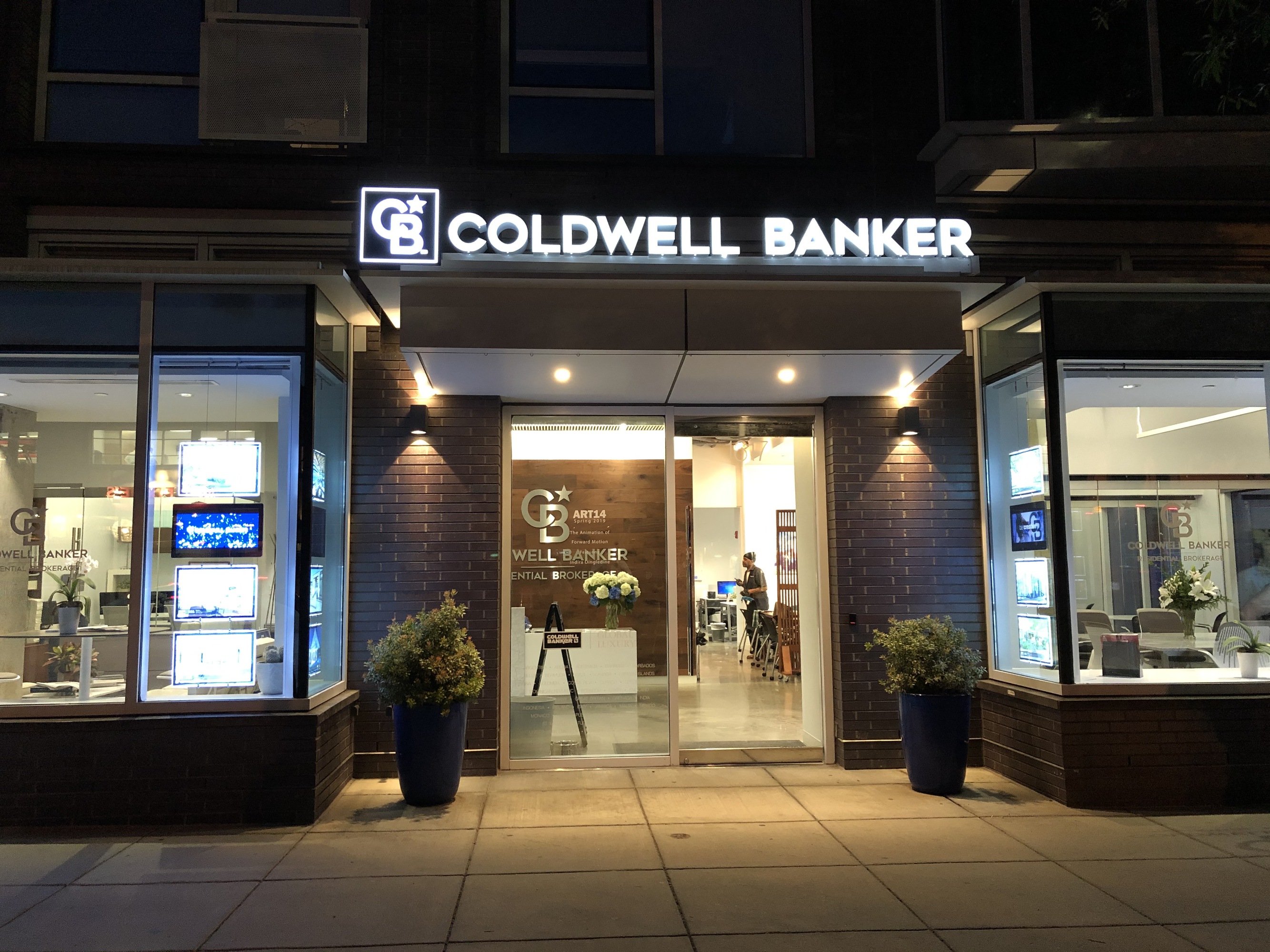
A Coldwell Banker office in Washington, D.C., that includes the new branding | Credit: Coldwell Banker
The new branding was rolled out in four test markets over the last several months. In a conversation with Inman this week, Coldwell Banker Chief Marketing Officer David Marine said that the feedback from those test markets has been positive, with the vast majority of people saying that the new imagery “feels fresh, it feels new, it’s the right change.”
Individual brokerages will have some freedom when it comes to the new branding.
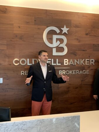
David Marine in a rebranded Washington, D.C. office | Credit: Coldwell Banker
For example, they will get to decide which of the four different yard signs they want to use. Marine also said that the testing produced a “family” of designs that are different, but feel like they belong together. He compared the differences to the icons that Microsoft or Google use for their various suites of products; individual applications have different icons, but they are meant to look like they’re part of the same grouping.
“It all feels like its in the same branded family,” Marine said of Coldwell Banker’s finalized branding. “It really creates a nice package.”
Ellen Williams, an agent at Coldwell Banker The Real Estate Group in Illinois, agreed that the response to the branding has been positive. Her office was selected as one of the test markets, and she told Inman that people would actually stop by her office when they saw the new imagery.
Williams also said that the beta testing allowed her office to figure out which signs would work well in specific environments. The office opted for yard signs that have a blue background, for example, because they want them to stand out against the snow they get for much of the year.
“I see it as a really positive, progressive change,” Williams said of the branding rollout and beta testing. “I like the way it was presented to the agents. I feel like they included us in some of this process.”
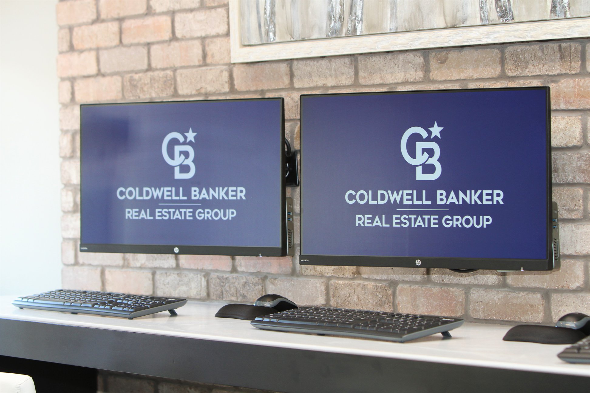
Computers displaying the new branding in Illinois | Credit: Coldwell Banker
The rebranding effort comes at a time of significant change for Coldwell Banker. Last week, the brand’s parent company Realogy announced major organizational changes amid struggles with the firm’s stock price. Those changes included a reordering of Coldwell Banker’s top leadership, with the New Jersey-based firm integrating its leadership and operations under NRT CEO Ryan Gorman. Current Coldwell Banker CEO Charlie Young will stay on in a senior advisory role.
However, Marine said that the rebranding process remains on track despite those changes.
Widespread rebranding at all of Coldwell Banker’s 3,100 offices will begin in 2020. Marine said that it could take years to get all offices fully rebranded, but that so far many brokerages have been asking to switch over.
“The biggest surprise is that there’s not a week that goes by that I don’t get a company asking about how they can rebrand sooner,” he said.
Source: click here


