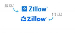
Call it a subtle but meaningful renovation: Zillow’s brand new logo, unveiled on Tuesday, April 2, is hardly a wild departure from its old one — but the real estate company did simplify and freshen up its brand.
The revamped logo gets rid of the square on the left of the word “Zillow” and inverts the colors of the house icon to a blue base and a white Z. Zillow is now written in a thicker font and a brighter blue color.
Overall, though, the logo still looks like a house with a ‘Z’ on it.
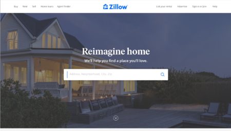
Zillow’s new website features a sleeker design | Credit: Zillow
The change, according to Zillow, is meant to “bring simplicity and joy to the process of finding a place to call home.” The real estate tech platform has also launched its own mortgage lending platform, Zillow Home Loans; redesigned its website with the new logo and larger listing images; and introduced a new agent scoring system for its Zillow Premier Agent online advertising service.
Zillow’s brand refresh includes “a simplified shopping experience,” and the addition of the word “Zillow” to its Premier Agent program for third-party real estate agents, making it “Zillow Premier Agent,” in all company references from here on out.
 The 3 most common questions luxury sellers ask
How to best address the top concerns of the high-end home seller READ MORE
What do you think of the new Zillow logo? Vote below.
(function(d, s, id){ var js, fjs = d.getElementsByTagName(s)[0], r = Math.floor(new Date().getTime() / 1000000); if (d.getElementById(id)) {return;} js = d.createElement(s); js.id = id; js.async=1; js.src = “https://www.opinionstage.com/assets/loader.js?” + r; fjs.parentNode.insertBefore(js, fjs); }(document, ‘script’, ‘os-widget-jssdk’));
Source: click here


